

I look through the onboarding experience of apps obsessively. Finance apps in particular. Not as a hobby, but as a benchmark. I want to make sure the product I’m working on meets the standard I’m setting for everyone else.
Onboarding is broad. It requires multiple layers of the product to work in sync, and that’s exactly what makes it tricky. It’s the tiny parts that drive the unexpected outcomes. A single error message, or missing feedback at a critical point, can make the experience seamless or break it entirely.
In finance, it’s harder still. There’s regulation to comply with. There are rules you cannot break. There’s information that is mandatory to collect. Ask too many questions and you lose the user. Ask too few and trust erodes. You’re designing inside a vice.
Here’s something that happened to me recently.
I was at REWE picking up their salads, and at the counter the cashier asked if I had the app. There was a raffle running. Who doesn’t like a freebie? I do.
So I tried to onboard. The app itself felt seamless. You could tell the craft was there; everything looked on point. But I couldn’t actually onboard, because the flow had to open in the browser first, that in-app browser that drives everyone nuts. I indulged it. I could see the raffle, and I wanted in. I tried to register, got automatically redirected, filled in every detail, then got returned to the app. And on return, I was asked to sign in again.
That was the first friction.
What made me abandon it entirely was the feedback loop. I sign up. I get into the app. I’m asked to log in again. Then I’m told to verify my phone number, after I’d already filled in all the required information, and the OTP never dropped. So I gave up. Paid for my food and moved on.
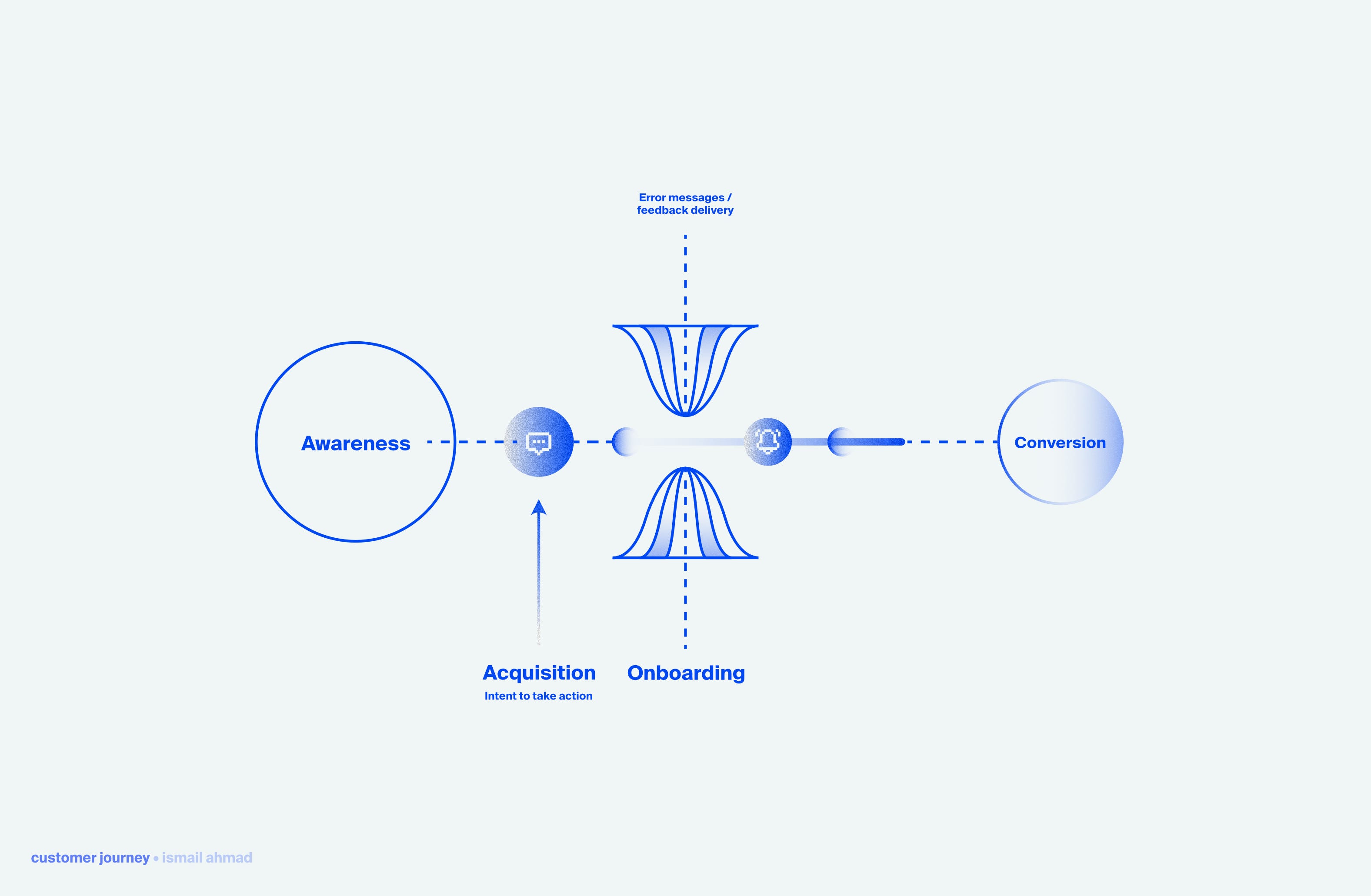
Mapped against the funnel, it looked like this:
Awareness, checked. I learned about the app from the cashier. Word of mouth, no selling required. I looked it up in the App Store and downloaded it.
Acquisition, checked. I installed it and opened it for the first time, with full intent to register. I wanted to win that raffle gift.
Onboarding, broke. This was the moment of perceived value, and it’s exactly where the whole experience collapsed. I tried to sign up, granted permission to my data: email, name, phone number. This is the tricky phase, and the second verification broke it.
According to SaaSFactor, removing additional form fields and unintended friction can recover up to 5 to 7% of conversions. Friction elimination is one of the highest-ROI optimisation activities you can run. And friction is exactly what halted my completion.
But the part most teams overlook is the error message. It’s one of the most underrated screens in a financial app, and it’s almost always an afterthought. Teams spend weeks on the happy path, and then barely a few hours on error states, validation, and testing whether the OTP flow actually keeps the customer informed.
In a financial product, the moments when things go wrong are the highest-stakes moments in the entire experience.
A failed OTP isn’t a minor inconvenience. Being asked to sign into an app you just registered for isn’t minor either. It’s a signal that something might be wrong with the product. Now imagine that product is holding your money. The damage is far more brutal.
Three things most error states get wrong:
The fix is buried, or absent entirely
No distinction between recoverable and unrecoverable failures
Legal voice at the wrong moment
None of this is hard to fix. It just requires someone to own it properly and give it the attention it deserves.
That someone is usually the difference between an app you trust with your money and one you abandon at the counter.